Picking the right lighting color temperature for your retail store isn’t just about making it bright enough to see; it’s a strategic decision that heavily influences how customers feel, how long they stay, and ultimately, what they buy. In short, the ideal color temperature hinges on your store’s brand, the products you sell, and the specific atmosphere you want to create. This guide will walk you through the practical aspects of choosing and implementing color temperatures to optimize your shopping ambiance.
Understanding Color Temperature: What It Is and Why It Matters
Before we dive into specifics, let’s get a handle on what “color temperature” actually means in the context of lighting Hazliving. It’s not about the heat a bulb produces, but rather the color of the light it emits, measured in Kelvins (K). Imagine a scale: lower Kelvin numbers (like 2000K-3000K) produce a warmer, more yellowish or reddish light, often described as “warm white.” As the Kelvin number increases (e.g., 4000K-5000K), the light becomes more neutral, resembling natural daylight (“cool white” or “daylight”). Go even higher (5000K-6500K+), and the light takes on a bluer, crisper tone, sometimes called “cool daylight.”
Why does this matter for your retail space? Because light color temperature directly impacts mood, perception of space, and even how products appear. Warm light tends to feel inviting and cozy, encouraging relaxation and linger time. Cooler light, on the other hand, often conveys professionalism, cleanliness, and can make products appear sharper and more vibrant. Understanding these fundamental effects is the first step in crafting an effective lighting strategy.
The Kelvin Scale Demystified
Let’s break down the common ranges you’ll encounter and their general characteristics:
- Warm White (2700K – 3000K): This is reminiscent of incandescent bulbs, with a soft, yellowish glow. It’s often associated with comfort, intimacy, and a traditional feel. Think living rooms, restaurants, and boutique shops aiming for a luxurious or cozy vibe. Products under this light might appear richer and softer, but colors like blues and greens can look muted.
- Neutral White / Cool White (3500K – 4500K): This range strikes a balance, offering a clean, crisp light without being overly warm or blue. It’s often compared to natural morning daylight. Many offices and general retail spaces find this a good all-around choice. It provides good color rendering for most products without feeling stark.
- Daylight / Cool Daylight (5000K – 6500K): This light is very bright and has a distinct bluish tint, mimicking bright midday sun or even overcast sky conditions. It promotes alertness and can make colors appear very vivid and true, especially blues and whites. Often seen in jewelry stores, showrooms, and areas where precise color matching is critical. However, too much can feel sterile or harsh if not balanced.
Impact on Customer Behavior and Perception
The human response to light color is deeply ingrained. Warm light triggers feelings of relaxation and comfort, often making customers feel less rushed and more inclined to browse. It can create an intimate atmosphere, which is excellent for high-end fashion, artisanal goods, or places where customers are encouraged to spend time making a decision.
Cooler light, conversely, tends to be more energizing and can promote a sense of efficiency and focus. It’s effective for highlighting details and making products pop. This can be beneficial in stores selling electronics, hardware, or sportswear, where a crisp, modern aesthetic is desired. It can also make a space feel larger and cleaner. However, excessive cool light without proper warmer accents can feel unwelcoming or clinical, potentially rushing customers out the door.
Matching Color Temperature to Your Brand and Products
This is where the practical application really comes in. There’s no single “best” color temperature for all retail stores because each brand has a unique identity and product mix. Your lighting needs to support and enhance both.
High-End Fashion & Boutiques
For luxury apparel, bespoke items, and boutiques, a warmer color temperature (typically 2700K to 3000K) is often ideal. This creates an inviting, sophisticated, and exclusive ambiance. It allows fabrics to appear richer, textures to feel more luxurious, and the overall shopping experience to feel more personal and leisurely. Think about how a fine dining restaurant uses warm, ambient lighting to encourage diners to relax and savor their meal; the same principle applies here. It helps to tell the story of quality and craftsmanship.
Using spotlights within this warm range can also create dramatic shadows and highlights, drawing attention to specific displays or key pieces without making the overall space feel dim. The goal is comfort and a sense of indulgence, not rapid turnover.
General Merchandise & Department Stores
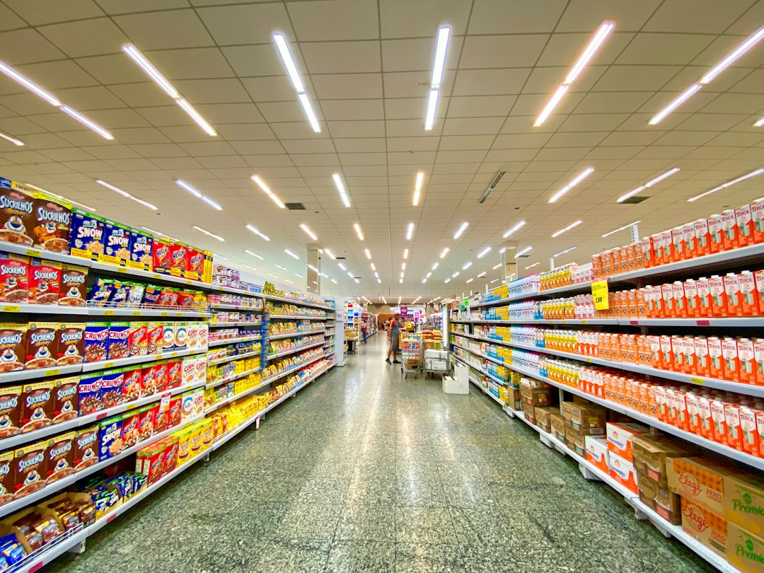
Stores with a broad range of products, like general department stores or medium-sized retailers, often benefit from a more balanced approach. A neutral white color temperature (around 3500K to 4000K) is a common choice. This range provides good overall illumination without skewing product colors too heavily in one direction. It feels professional and efficient but isn’t overly harsh.
Within these larger spaces, you can use different color temperatures in specific departments. For instance, the cosmetics section might use slightly cooler lighting (4000K-4500K) to ensure accurate makeup application and product color rendering, while a home goods section nearby might lean a bit warmer (3000K-3500K) to evoke a cozy, domestic feel. The key here is consistency within zones but flexibility across departments.
Electronics, Hardware & Sporting Goods
For categories where precision, clarity, and vibrancy are paramount, such as electronics, hardware, or sporting goods, cooler color temperatures are typically preferred. A range of 4000K to 5000K works well. This cooler light helps to highlight intricate details, make colors pop, and convey a sense of modernity and cutting-edge technology. For example, a crisp 4500K light can make the metallic finishes on a new gadget gleam or show the true colors of athletic wear.
In a hardware store, bright, neutral to cool lighting helps customers clearly see product features, read labels, and evaluate materials accurately. It also makes the space feel organized and efficient. The focus here is on functionality and clear presentation.
Jewelry Stores & Showrooms
Jewelry is a special case where the right lighting can dramatically enhance sparkle and brilliance. While some jewelers prefer a very cool light (up to 6500K) to maximize diamond sparkle, a mix is often most effective. A base layer of 4000K to 5000K can provide general illumination, making the metals and stones appear clean and vibrant.
However, to truly make diamonds and other gemstones glitter, you might strategically use very high Kelvin spotlights (6000K-6500K) or even specialized full-spectrum lighting directly on display cases. The cool, almost blue light reflects beautifully off facets, creating that desired “bling” effect. For gold and warmer-toned stones, a slightly warmer accent light (3000K-3500K) can enhance their richness. It’s about creating contrast and sparkle.
Food & Grocery Stores
Lighting in food retail is critical for making products look fresh and appetizing. Different departments require different approaches:
- Produce: A slightly warmer light (around 3000K-3500K) can enhance the natural colors of fruits and vegetables, making reds look redder and greens look greener. Too cool, and produce can look dull or artificial.
- Meat & Seafood: Specialized “pink” or “red” tinted lighting (often around 2700K-3000K with a high CRI, sometimes using specific LED wavelengths) is often used over meat counters to make cuts appear redder and fresher, enhancing their appeal. Similarly, light with a slight blue tint can make seafood look cleaner and more appealing.
- Bakery: Warm lighting (2700K-3000K) creates a cozy, comforting atmosphere that highlights the golden crusts of bread and the warm tones of baked goods, evoking feelings of freshness and deliciousness.
- Dairy & Frozen: Cooler lighting (4000K-5000K) is usually preferred here to convey a sense of cleanliness, freshness, and low temperature, aligning with the nature of the products.
The Importance of Color Rendering Index (CRI)
While color temperature tells you the color of the light, the Color Rendering Index (CRI) tells you how accurately that light reveals the true colors of objects compared to natural daylight. It’s measured on a scale from 0 to 100, with 100 being perfect color rendering. For retail, CRI is almost as important as color temperature, if not more so, especially when customers are evaluating product colors.
Imagine trying on a navy blue shirt that looks black under poor lighting, or a vibrant red dress that appears dull. This leads to customer frustration and potential returns. A high CRI ensures that the colors of your merchandise are displayed as accurately as possible, building trust and reducing buyer’s remorse.
What is a Good CRI for Retail?
For most retail applications, you should aim for a CRI of 80 or higher. Many general commercial LEDs offer this. However, for stores where accurate color perception is critical – like fashion boutiques, art galleries, cosmetics counters, or high-end showrooms – you should aim for a CRI of 90 or higher. This “high CRI” or “museum quality” lighting ensures that subtle color differences are visible and that products truly pop.
Don’t compromise on CRI, especially if your products rely heavily on color appeal. A low CRI light, even if it’s the “right” color temperature, can make your merchandise look drab, faded, or simply “off,” regardless of how good the product itself is.
Layering Lighting for Dynamic Ambiance
Rarely will a single color temperature or type of fixture suffice for an entire retail space. The most effective lighting strategies involve layering different types of light, often with varying color temperatures, to create a dynamic and inviting environment. This approach allows you to highlight specific products, define zones, and influence customer flow.
Ambient Lighting: The Foundation
Ambient lighting is your general, overall illumination that ensures the store is bright enough to navigate comfortably. It sets the baseline mood. For most retail, this will be your primary lighting source and might be a neutral white (3500K-4000K) in a general merchandise store, or a warmer white (2700K-3000K) in a boutique. This base layer should be consistent and evenly distributed, often achieved with recessed downlights, track lighting, or large overhead fixtures.
Accent Lighting: Drawing Attention
Accent lighting is where you strategically draw attention to specific products, displays, or architectural features. This is often achieved with track lights, spotlights, or adjustable fixtures. Here, you might use a slightly different color temperature than your ambient light to create contrast or enhance product features. For instance, in a store with 3500K ambient light, you might use 4000K spotlights on specific items to make them stand out with a crisper look, or 3000K spotlights to make a product feel more luxurious.
The key with accent lighting is to be intentional. It should be three times brighter than the ambient light in that area to be effective. This brightness contrast, combined with appropriate color temperature, makes certain items pop.
Task Lighting: Practicality and Function
Task lighting provides focused illumination for specific activities, like at a cash wrap, fitting room mirrors, or behind a service counter. For cash registers, a neutral white (3500K-4000K) is often practical, providing clear visibility for transactions without being distracting.
For fitting rooms, the lighting is particularly crucial. It needs to be flattering yet accurate. A mix of warm (3000K) and neutral (4000K) light, or adjustable lighting that allows the customer to choose, can be effective. The goal is to make the customer look good and feel confident in their purchase, while still allowing them to see the true color of the garment. Avoid harsh overhead-only lighting that casts unflattering shadows.
Decorative Lighting: Enhancing the Aesthetic
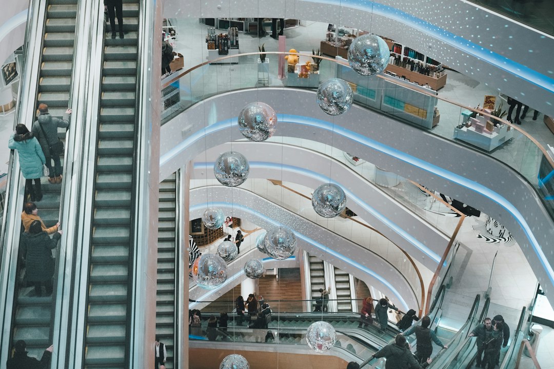
Decorative lighting includes chandeliers, pendant lights, wall sconces, or unique fixtures that contribute to the store’s overall aesthetic and brand identity. While they provide some light, their primary function is visual appeal and mood-setting. Their color temperature should align with the desired ambiance and complement the other layers of lighting. For example, a vintage-style chandelier might naturally emit warmer light, reinforcing a classic or luxurious feel.
Practical Implementation and Common Pitfalls
Once you understand the principles, the next step is implementation. It’s not just about picking bulbs; it’s about designing a cohesive system.
Test Before You Commit
Never commit to a full lighting overhaul without testing. Purchase samples of different color temperature bulbs or fixtures and install them in a small section of your store. Observe them at different times of the day, with different products, and get feedback from staff and even a few trusted customers. How do the products look? How does the space feel? This hands-on testing is invaluable.
Consider Dimming Capabilities
Dimming is a powerful tool for flexibility. Being able to adjust the light intensity can dramatically change the mood of a space throughout the day or for special events. Ensure your chosen fixtures and bulbs are compatible with dimmers. While dimming typically doesn’t change the color temperature of LEDs significantly, it does affect the perceived brightness and ambiance.
Mixing Color Temperatures Effectively
While mixing color temperatures can create depth and interest, do so deliberately and sparingly within the same visual field. For instance, a 3000K ambient light and 4000K accent light can work. However, avoid drastic jumps like 2700K next to 5000K in an adjacent area, as it can look jarring and unintentional. Stick to a general “color temperature story” for your store and make small, intentional shifts for specific effects.
Watch Out for Glare and Shadows
Color temperature is only one piece of the puzzle. Poorly positioned lights can create harsh glare or unflattering shadows, regardless of their color. Ensure lights are positioned to illuminate products evenly, minimize reflections on shiny surfaces, and avoid casting shadows on customers or signage. Lighting designers are experts in preventing these common issues.
Energy Efficiency and Maintenance
While not directly related to color temperature, it’s a practical consideration. Modern LED lighting offers incredible energy efficiency and long lifespans, significantly reducing operating costs and maintenance. When selecting fixtures, prioritize LEDs with high efficacy (lumens per watt) and good warranties. Consistency in your bulb types will also simplify maintenance and replacement.
The Human Factor: Staff and Customers
Finally, remember the people in your store. Staff need comfortable lighting to work effectively without eye strain. Customers need lighting that makes them feel good, helps them make informed purchasing decisions, and encourages them to return. The optimal shopping ambiance isn’t just about what looks good to you, but what creates the best experience for everyone who enters your store.
By carefully considering your brand, products, desired mood, and the practicalities of implementation, you can craft a retail lighting scheme that not only illuminates your space but actively contributes to a successful and engaging shopping experience.